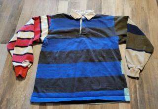
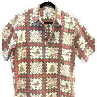
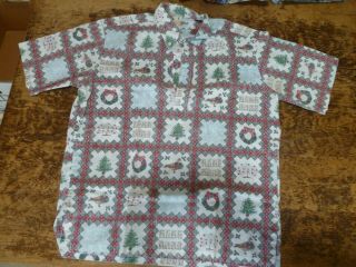
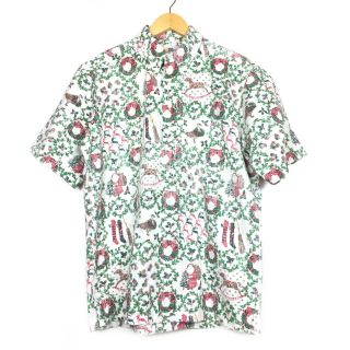
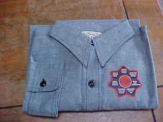
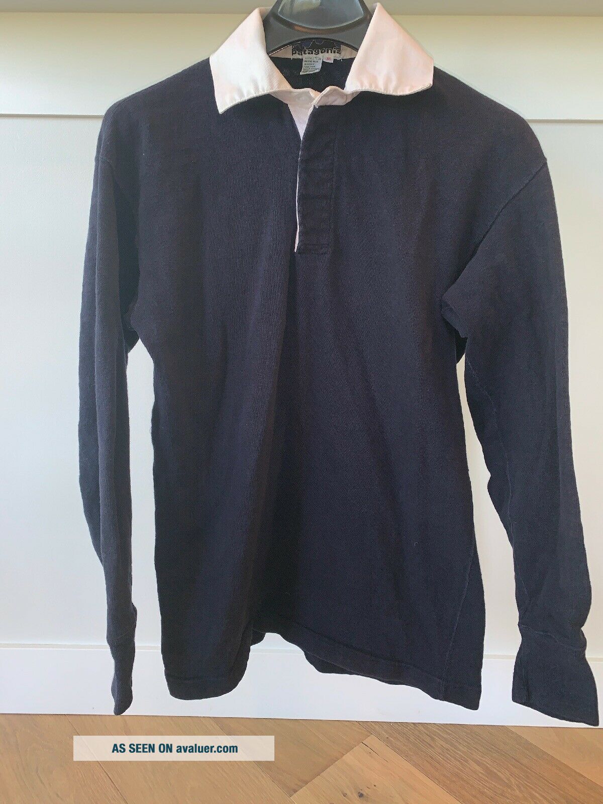
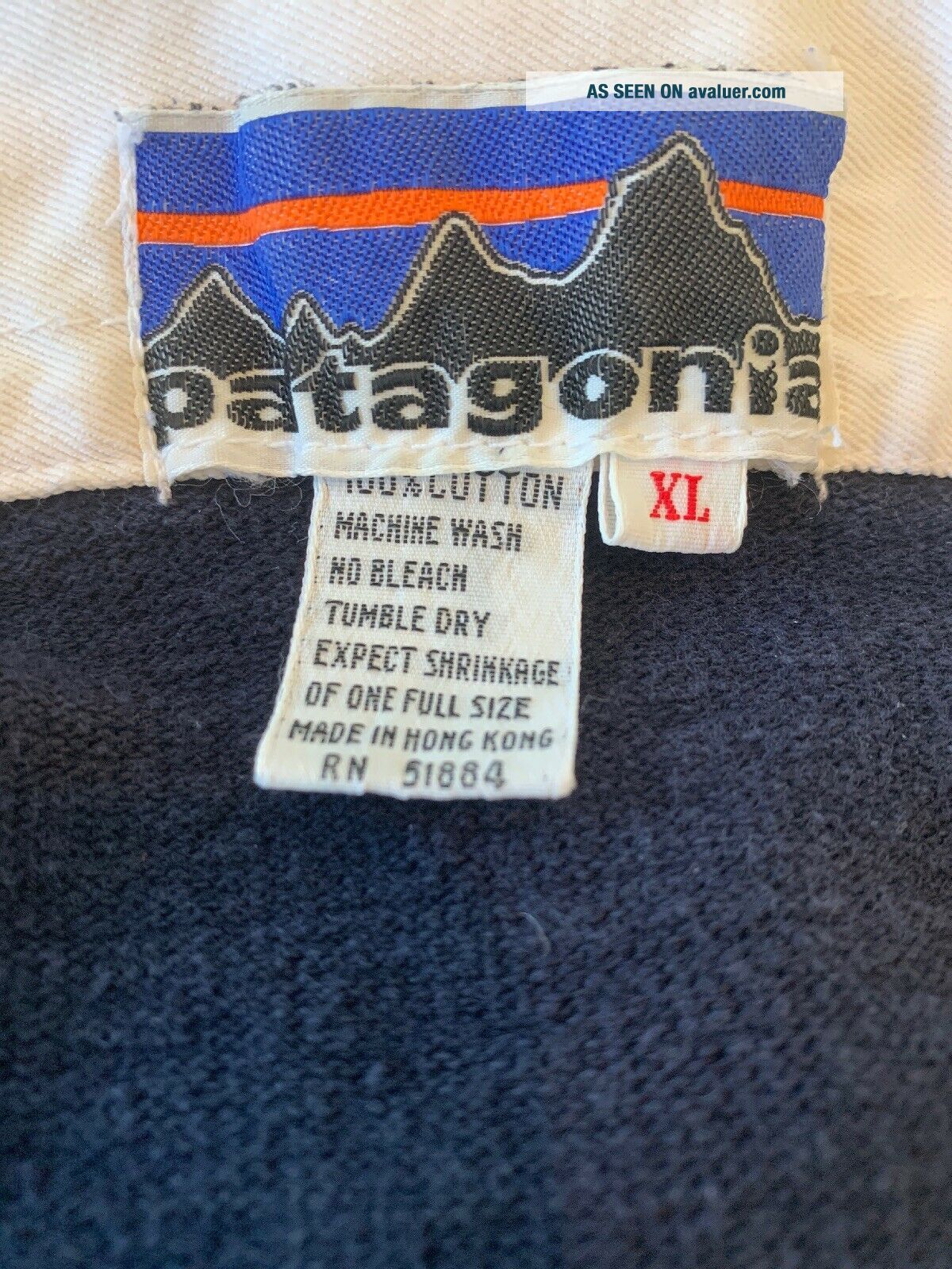
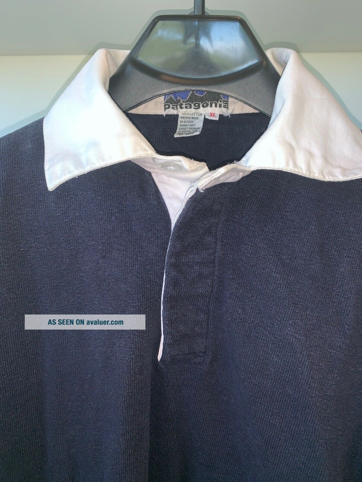
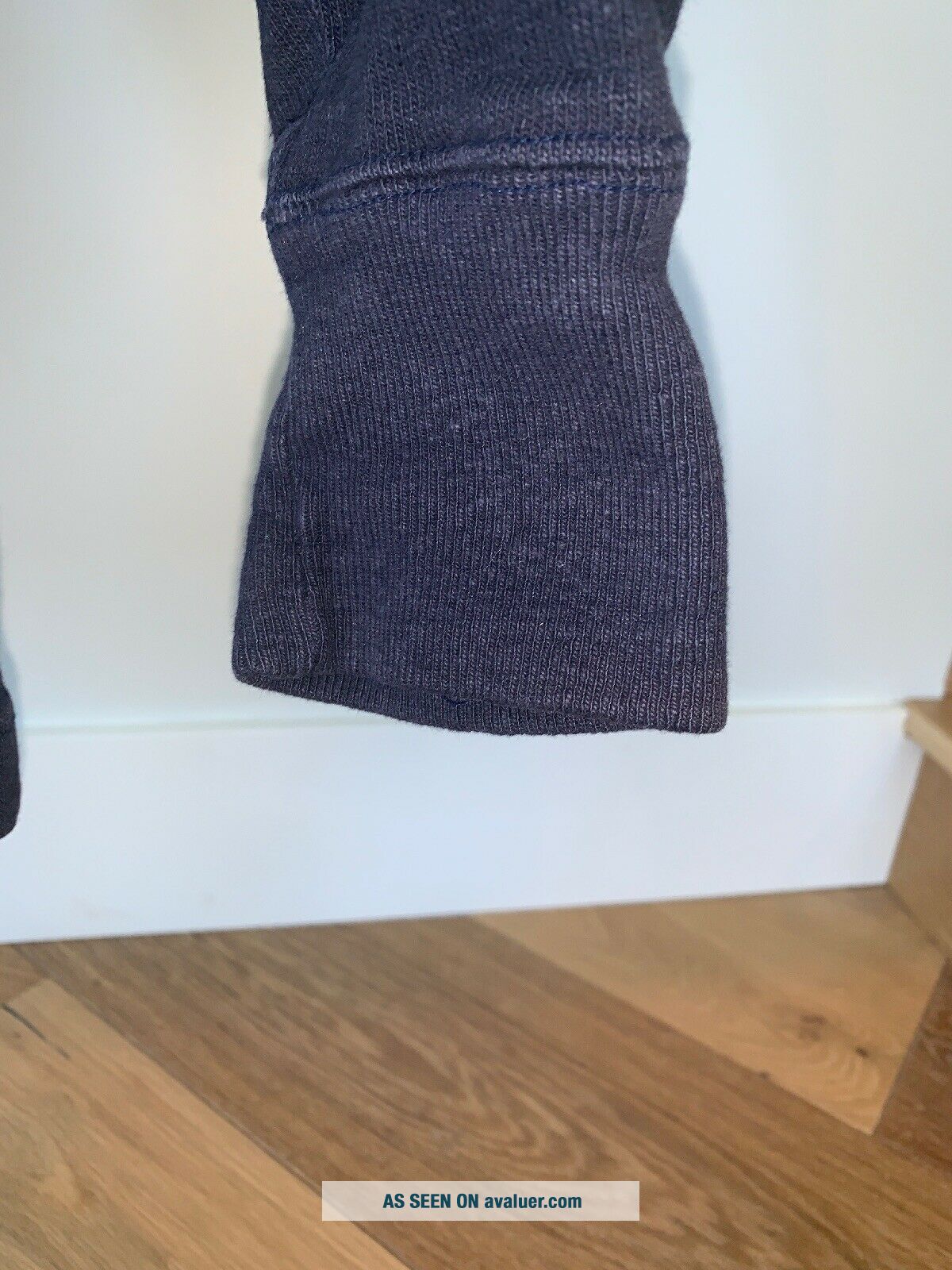
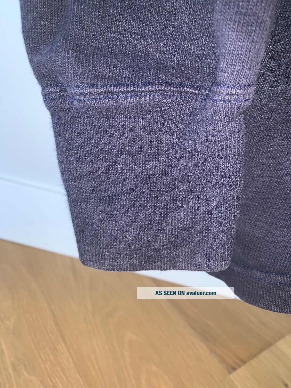
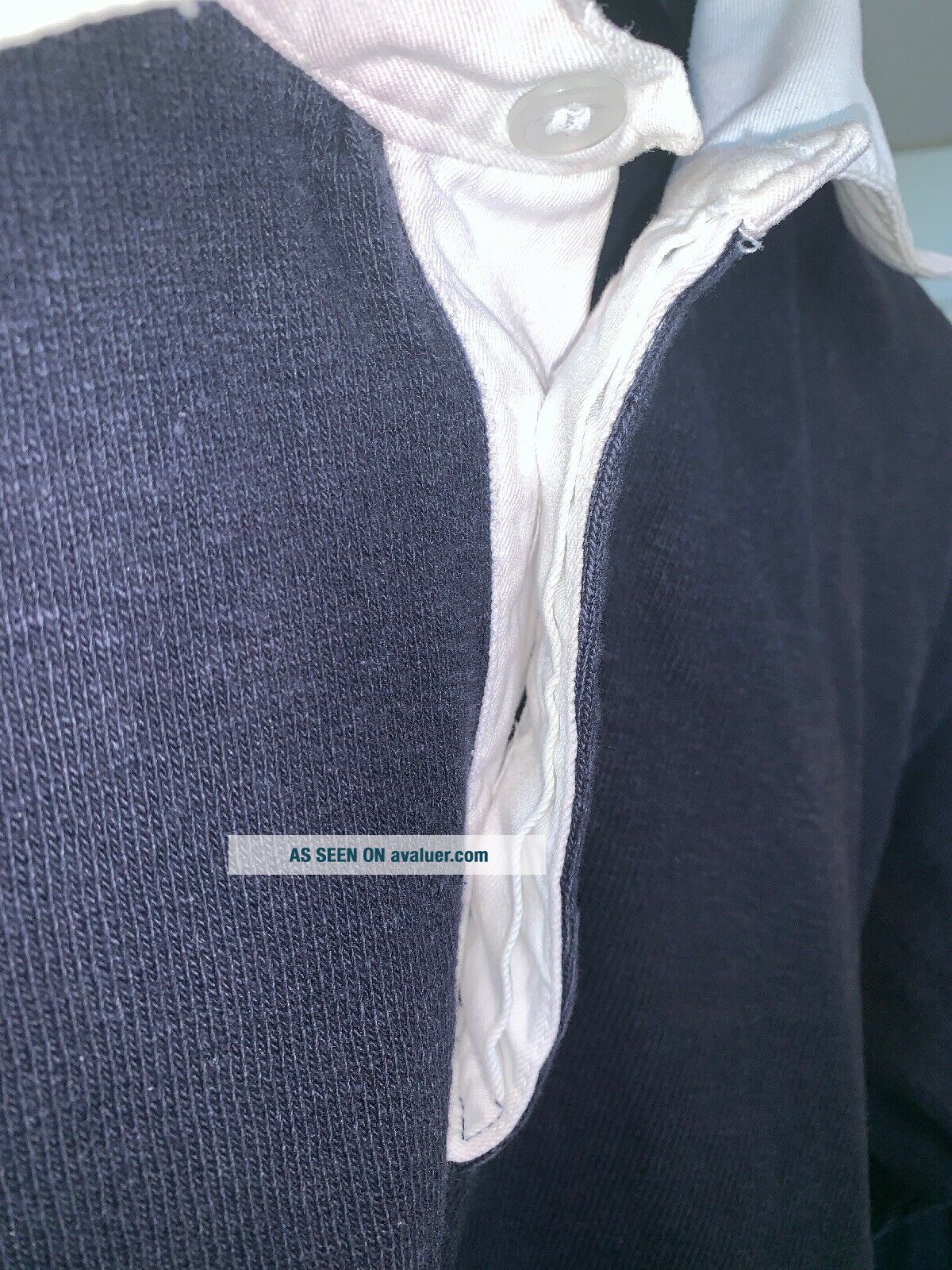
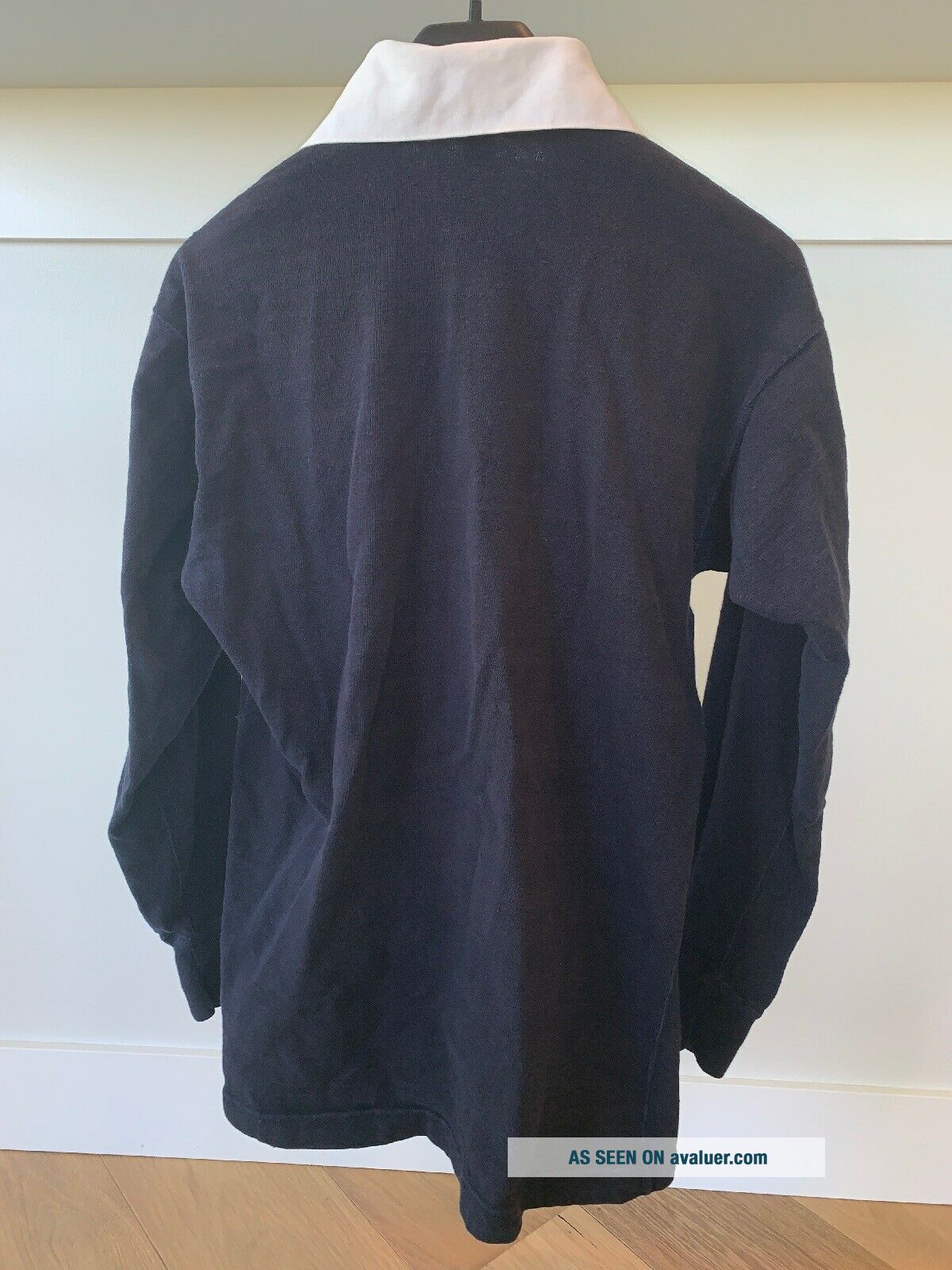
Rare Vintage Label Patagonia Rugby LS Shirt XL Blue.
Item History & Price
| Reference Number: Avaluer:6815735 | Brand: Patagonia |
| Material: Cotton | Size Type: Regular |
| Sleeve Length: Long Sleeve | Size (Men's): XL |
| Color: Blue | Style: Polo, Rugby |
Own a very cool piece of history! Rare Vintage Original Label Patagonia Rugby LS Shirt XL Blue.
From Outsideonline.com:
Rugby Shirt- Credit the rugby shirt for launching Patagonia. When climbing in Scotland, Chouinard bought an Umbro shirt that looked a lot like this one. Why? He sized up the tough fabric, the bulletproof stitching, the stand-up collar, and rubber buttons and recognized that rugby kit would stand up to the rigors of rock climbing. He was right. Pretty soon, Choui...nard’s friends wanted them. So did all sporty guys of a certain age, for that matter. So Chouinard imported the shirts, and and sales took off. “I began to see clothing as a way to help support the marginally profitable hardware business, ” he wrote in Let My People Go Surfing. The shirt pictured here was worn by Chouinard himself. The “Chouinard Equipment for Alpinists” label would be replaced with the Patagonia label within five years.
Original Patagonia Logo - According to Patagonia freelance artist Jocelyn Slack, the magic of a logo is that it’ll work if it makes the client “feel” what’s in their head. “I felt like the core collaboration was between me and Yvon, because he definitely had an idea of what he wanted. When he saw what he wanted, that was it.” Chouinard wanted a logo for the clothing division. It was between “Patagonia” and “The Great Pacific Iron Works, ” the name of their retail store. Slack was assigned the Patagonia logo and another artist the GPIW logo. Slack remembers feeling like the two artists were pitted against one another. For inspiration, Chouinard gave Slack a climbing guide to the Fitz Roy Range of the Patagonian Andes. “So there were these old black-and-white photos, some with routes and descriptions of Fitz Roy. I did these pencil drawings of the mountains…and the big silhouette, and I think he was the one that maybe wanted some color. At one point, CEO Kris McDivitt mocked up a bunch of fonts spelling Patagonia. She asked Vincent Stanley his opinion one day, and he said the logo looked like Macy’s or Bloomingdale’s, and she threw it at him. ‘Patagonia Patagonia Patagonia’ all over the place. They kinda hashed it out, picking a font.” The logo was first used in the Spring 1976 collection.